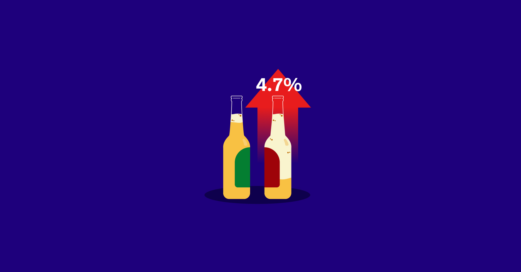
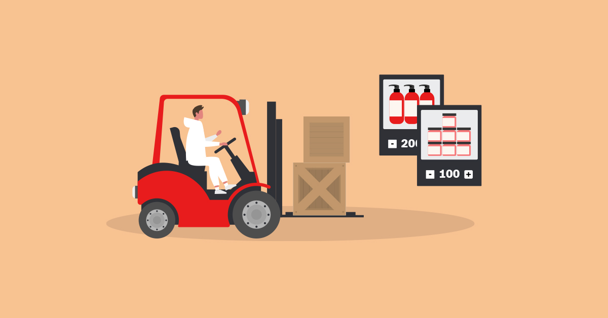
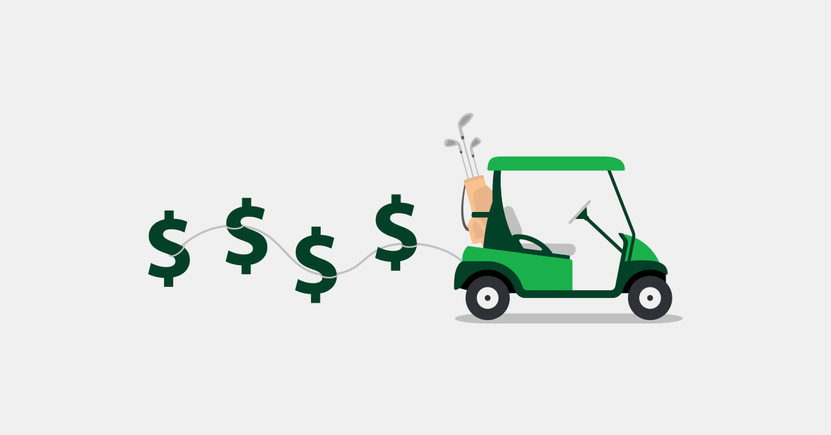
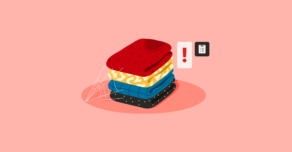
As you’re reading this post, we’re willing to bet that you have a mobile device within arm’s reach. Heck, it’s even possible that you’re on your phone or tablet right now.
It goes to show that ubiquity of mobile is undeniable. And in today, people aren’t just using their phones or tablets to communicate or check their socials. Increasingly, consumers are using their mobile devices to research products, compare prices, and even buy.
The great news is, retailers are aware of this, and we’re seeing more merchants set up shop on the small screen. That said, while retailers do recognize the importance of mobile ecommerce, there’s still a long way to go.
Many retailers still aren’t providing the best mobile browsing experience, and it’s costing them customers.
In this post, we’ll discuss some of the common mobile mistakes retailers are making, along with recommendations on what to do instead. By the end of this post, you should walk away with ideas and fixes for your mobile strategy.
1. Making your mobile site difficult to navigate
Many retailers have mobile sites that are difficult to navigate. They’re not responsive and the elements (i.e. images, buttons, links) either aren’t big enough or are too close together that they’re difficult to tap.
Additionally, some mobile sites make specific categories or products hard to access. Links or subcategories are on separate pages, thus increasing load time.
You can fix these issues by designing your mobile site to be “fat-finger proof”. Use large, beautiful pictures and avoid small links or text.
You could also make use of mobile-friendly drop-down menus. Instead of letting users click through separate pages when they’re exploring products and categories, incorporate drop-down menus so the links they need appear instantly.
One retailer doing this well is by-Walski in the UK. by-Walski has an array of products under various categories, but they keep things organized and easy to access using menus that can easily be expanded or collapsed within the page. That way, when a user wants to check out a particular subcategory, they don’t have to navigate away from the main menu.
2. Having a cumbersome search tool
Many customers shopping on mobile don’t have the luxury to sit around and browse a website slowly. Some of them are on the move, others could be standing in line somewhere, and all of them want to find what they’re looking for in as few taps as possible. If they can’t experience that on your site, they’ll take their business elsewhere.
That’s why you should invest in a robust mobile search experience. Don’t just slap on a search tool and call it a day. Optimize it and make sure it’s easy to find and use.
One retailer that has a great mobile search function is Walmart. As you can see below, Walmart has a search tool on every page of its site, so users who need to find something can get to the search tool no matter where they are on the site.
Not only that, but the search function has an auto-complete feature that predicts what people are looking for as they type. Users won’t have to type their entire search query, and this makes the process much faster.
See if you can incorporate these features into your site. Make your customers’ lives easier by giving them a search tool that they can find anywhere, and can predict what they’re looking for.
3. Making it difficult to map or call your physical store
Don’t bury your store’s address and phone number. Make it easy to find, either by displaying them on your homepage or by placing them in an easy-to-access contact page.
You also want to ensure that users can map your store or give you a call right from your site. Don’t just list your phone number — make it “clickable” so when people tap on it, they’ll be able to call you. Same goes for your address. Incorporate a “click-to-map” functionality so users can easily navigate to your store.
A report by PayPal Media found that 57% of mobile landing page clicks are from actions like click-to-map and click-to-call, indicating that these two functions are what mobile shoppers utilizing the most.
Check out what Michael Kors is doing. The retailer’s mobile site automatically detects the user’s location and displays the nearest store’s address and phone number on the homepage.
Michael Kors also makes it simple to map their store. It has a “Get Directions” link that automatically launches the user’s maps application, saving them time.
4. Not connecting mobile commerce with other sales channels
Don’t isolate your mobile strategy. Make sure it works together with your other sales channels so you can give customers a “shop anytime, anywhere” experience.
You can, for instance, launch a “buy on mobile, pick up in-store” initiative that lets customers complete purchases and arrange store pick up right from their mobile device.
An increasing number of merchants have started doing this, but unfortunately, many of them drop the ball when it comes to in-store pickup experience. While customers can place orders using their mobile device, the pickup process is often confusing when they get to the store. Where should they go to pick up their items? Do they have to fall in line? Who do they approach? Many times, these matters are unclear.
Don’t make the same mistake. If you’re implementing mobile ordering, see to it that you design an in-store pickup experience that’s fast, clear, and convenient.
Starbucks is doing an excellent job at this. Its app now has a feature that lets people order ahead using their phone. And when they get to the store, there’s a designated area for order pick ups. No need to fall in line or ask around where your order is. Just head to the sign, take your order, you’re done.
Final words
Mobile is a channel that’s becoming as important as brick-and-mortar and ecommerce. Don’t get left behind. Strengthen your mobile commerce strategy and see to it that you’re bringing delight to your customers no matter where they are.
We hope this post brings you closer to doing just that.
What other mobile mistakes do you see retailers making? Let us know in the comments.
Recommended Reading
If you enjoyed this post, you may want to check out our free ebook, Retail Survival of the Fittest.
This book serves as your practical guide to modern-day retail success. Learn how to use mobile technology, big data, and other digital tools to improve your brick-and-mortar store and ensure that it is well-equipped to engage and convert today’s savvy shoppers.
About Francesca Nicasio
Francesca Nicasio is Vend's Retail Expert and Content Strategist. She writes about trends, tips, and other cool things that enable retailers to increase sales, serve customers better, and be more awesome overall. She's also the author of Retail Survival of the Fittest, a free eBook to help retailers future-proof their stores. Connect with her on LinkedIn, Twitter, or Google+.
Reply